

A New Look for Thalamus Core. A Smarter Way to Navigate.
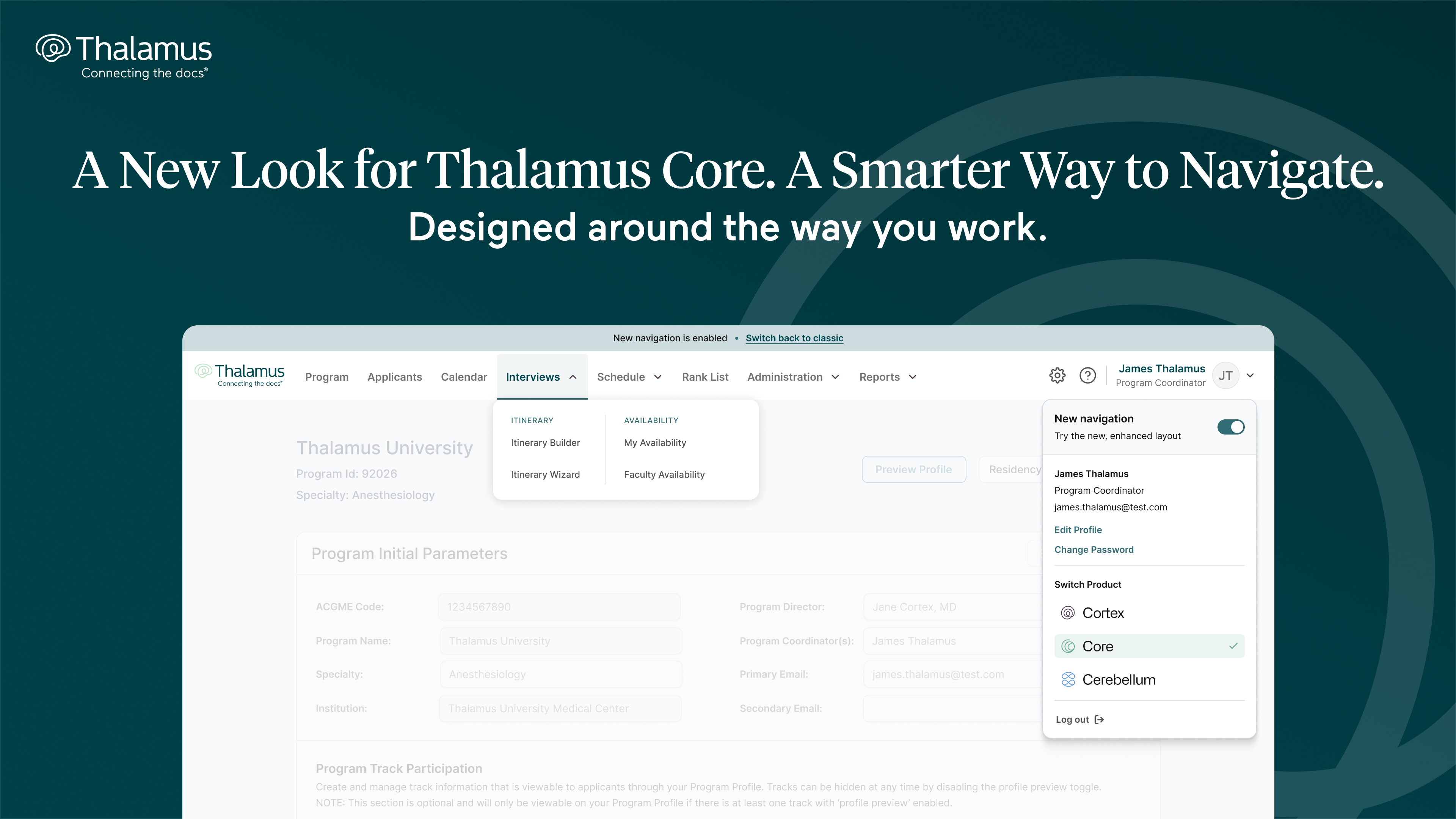
Designed around the way you work
Over the past year, you may have noticed Thalamus looking a little different. We’ve introduced refreshed experiences across the platform, including Thalamus Video, and most recently, an enhanced applicant experience. It’s all part of a broader effort to make Thalamus more connected, intuitive, and easier to use.
At our recent webinar, The Next Pathway: What’s New at Thalamus, we shared a first look at what’s ahead for the program experience, too.
Today, that next chapter begins in Thalamus Core.
We’re introducing a new navigation experience for program users, the first step in a broader refresh of Core, designed to make the tools you already use easier to find, faster to reach, and more intuitive to navigate.
Everything you need, with fewer clicks
Thalamus Core has grown significantly over the years. As we’ve added new capabilities, workflows, and integrations, the number of places programs can go within the platform has grown along with them.
So we went back to a simple question: how can we make it easier to get where you need to go?
The new navigation reorganizes Core around the way programs actually work. Related tools are grouped together, commonly used features are easier to find, and navigating between different parts of recruitment requires fewer clicks.
You’ll also see the updated Thalamus visual design beginning to make its way into Core, creating a more consistent experience across the platform.
A new look, not a new learning curve
While the navigation is changing, the functionality underneath is not.
Your familiar Thalamus workflows, tools, and capabilities remain right where you expect them. You won’t need to relearn how to build an itinerary, manage applicants, schedule interviews, create a rank list, or manage your program.
Try it today
The new navigation is available today to Thalamus Core program users.
When you log in, all program users will see a pop-up offering the new navigation bar. Click "Try it now" to turn on the new layout, or "Not now" to keep things as they are.
Your selection is personal to your account, so each member of your program can choose when they’re ready to try the new experience.
And, if you want to return to the classic navigation at any point during this transition period, click "Switch back to classic" in the blue menu bar at the top of the screen, or toggle the new navigation bar on or off anytime from your user account menu by selecting your account icon in the upper right-hand corner. That flexibility is intentional.
We encourage programs to start using the new navigation now, as it will become the standard Core experience as more enhancements roll out over the season.
This is only the beginning
The new navigation is the first visible step in a much broader update to Thalamus Core. Throughout the season, we’ll continue refreshing key parts of the program experience, including:
- Program Profile
- Program Calendar
- Program Applicants Page
- Itinerary Builder
- Itinerary Wizard
- Program Rank List
Additional areas of Core will follow.
Across each of these updates, you’ll see the same approach: cleaner interfaces, clearer workflows, better organization, and easier access to the information and tools you need.
Our goal is to preserve what works, simplify what can be simpler, and steadily improve the Core experience without disrupting the workflows programs rely on every day.
Thalamus has always been built alongside the GME community, and these enhancements represent our continued investment in making every part of Thalamus faster, more connected, and more intuitive for the people who use it.
Explore our latest insights and updates.

A Faster, Smarter, More Intuitive Experience for Applicants


Public benefit corporation launches governance infrastructure to expand efforts for transparent, auditable, and accountable AI in medical education recruitment and physician selection.


%201.svg)